Portfolio
Mouse over the images below to see samples of my work. Enjoy! To see web sites I've designed or contributed to, please go to the "Links" page.


The first in a series of attempts at redesigning my employer's logo.


The second in a series of attempts at redesigning my employer's logo.


The third in a series of attempts at redesigning my employer's logo.


Another exercise in creating a logo for a former employer.

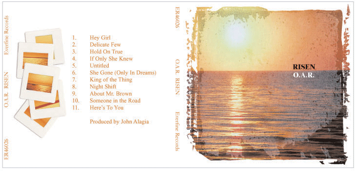
A CD jewel case layout design (or re-design) for an OAR CD, as part of an exercise for a class in QuarkXpress.


The result of an exercise in a Photoshop class, using several photos and various tools to create this patriotic image for the country of Canada.

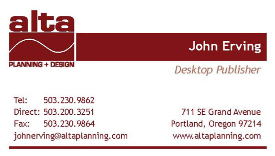
The front design of the new Alta Planning + Design business card.


The back of the same card, designed with bleeds (shown with the marks for cutting and trimming).


A logo design for a client of Macro International, formerly SHS at the time I worked there.


A second logo design for the same client.


A logo design for SHS.


A second logo design for SHS.

The fourth in a series of attempts at redesigning my employer's logo.


A cover design for a proposal for Alta Planning + Design.


An illustration done using only letters, an exercise from a Typography class I attended at the Marlyand Institute of Art in Baltimore, Maryland.

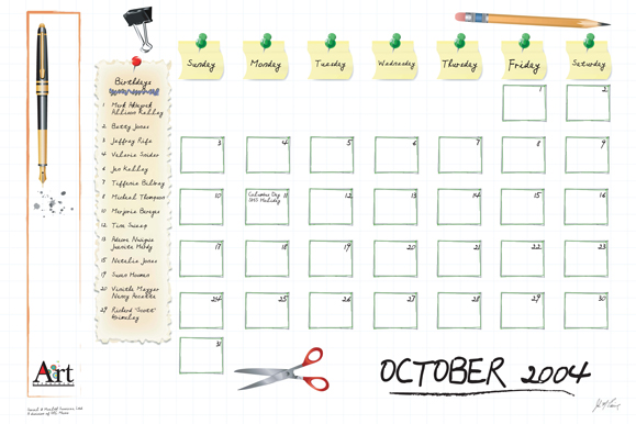
A calendar design that was an Art Department internal project for one year, with each Art Department member taking a month. The concept was so popular that the rest of the company wanted the calendars as well, and we continued the exercise through a second year. I was responsible for October in the first year (2004). I was going for both functionality and the concept of a calendar you could keep on your desk.

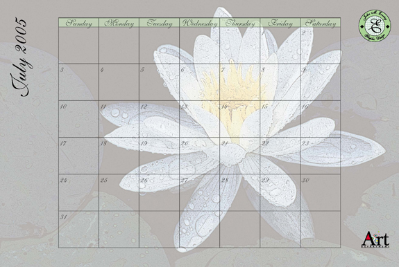
Here's my second year design, for the month of July (2005). This design was using the flower of the month and again creating a functional and usable calendar. One complaint that some of the non-Art Department employees had about the Graphic Designers' designs was they lacked the option to write in notes or dates. My designs seemed to be favored because those were part of the functionality of my design.

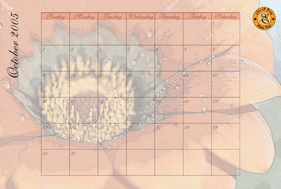
Here's a design for the month of October in 2005, independent of the Art Department exercise. I originally made this as a gift to a friend at work but once people saw it, I wound up printing a few more for others in the company.

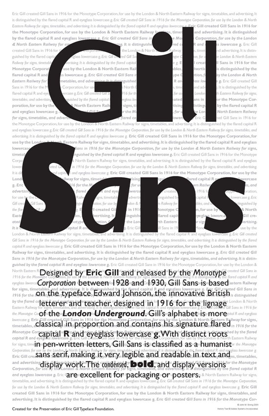
This is another exercise from the Typography class. This assignment was to create a promotional poster for the typeface of our choice (no Arial or Times New Roman allowed). We had to illustrate the options of the typeface as well as some of its history.

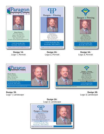
While working at SHS, I was selected to design the logo and collateral materiels for a division called Paragon Printing. The logo in the Design3 options was chosen as well as the horizontal business card layout. The logo and design was applied to a variety of other materials, from stickers to note pads to folders.
